Sunday, June 26, 2011

Contemporary

The Current Contemporary
Contemporary isn't one thing and one thing only, it is the basic style, the one-size-fits-all of design. The style of contemporary changes with the times, but our current Contemporary is a little like Swiss international meets freedom. It is usually a simple white (or colour) background with some simple text, this is the base of Contemporary from there designers branch out a bit to make it different. Sometimes they mess around with the text, they; jumble it or vary the sizes of the letters. They add a simple picture or two. Some times they would use a picture that looks like a letter in place of the letter it's self. But the key to contemporary is to keep it simple and not to clutter the page.


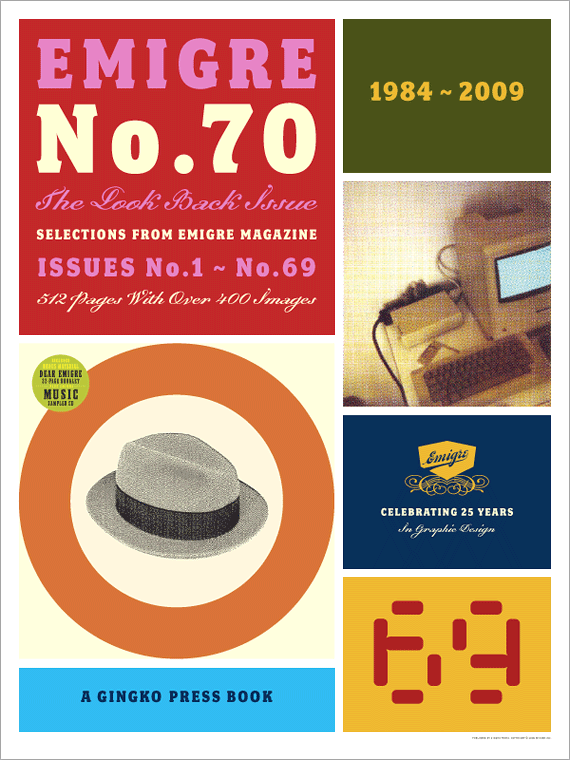
< This ad holds true to the contemporary style with a simple colour scheme, grid format, plain font, and is quick-to-the-point. It is simple and I like it because of that.


> This is also a classic/contemporary advert, Plain background, one image, a couple of logos, and minimal text. I live this ad because of the eye catching text "Hello", I like how they played around with the "L's" by using the signal bars from the product, and they used four signal bars in stead of two because they wanted to tell people "hey, buy our new phone and you will never have a problem finding a signal again." (totally not true, even the best phones have trouble getting a signal in the middle of nowhere).


References: 
http://gds.parkland.edu/gds/!lectures/history/1980/contemporary.html
http://www.selectism.com/news/2009/02/11/harley-davidson-ads/
http://www.techdigest.tv/2010/07/samsung_give_ch.html

Postmodern

The Playful Post
Postmodernism was a time where every one wanted to break away form the "boring" simplicity of the Swiss era, so naturally people went from one extreme to another. the Postmodernists were all about finding ways to break the rules, they shuck things up by turning them inside out and up side down. mostly they were interested in ornamentation, symbolism and making things as funny as they could. they used lots if geometric shapes and pot natural curves in odd places. the posters and advertisements were often styled around either collage or geometric shapes. And a lot of the highlights of the Postmodern era was based around eccentric architecture and furniture that was either a distorted version of natural shapes, or a jumble of geometry.

< The "Ecco Telephone" is one of my favorites from this era. I like it because it is sleek and different at that the same time. the Postmodern era was all about thinking outside the box. The curve down the middle sets this phone apart from its more simple and straight predecessors.


> Ettore Sottsass's Book shelf with its simple eccentricity and odd angles, is my all-time-favorite from this era. I'm not too fond of the colours, but if I could get my hands on one I would love it till the day I died (provided I could paint it black).


References:
http://gds.parkland.edu/gds/!lectures/history/1975/postmodern.html
http://www.eccoid.com/item.php?cat=2&id=4&imageid=4
http://www.furniturefashion.com/2008/04/09/1980s_ettore_sottsass_carlton_bookcase_by_memphis_italy.html

Thursday, June 23, 2011

Digital

Cut-and-Paste
The designers of digital era are like a bunch of pre-schoolers. Digital design (our current era) is based around technology. With a thousand of tools and techniques at our finger tips you'd think it would be a snap to just whip up a fantastic poster and produce it, but no. the easy part is producing it, designing it is harder. sure there is a lot you can do but it still takes a lot of thought, planing and knowledge to come up with something that looks good and does the job its supposed to do, at the same time. Trial and error are key to all designing but the main key to Digital design is simply the basics; Cut and Past. Some of the best designers of this era made their names through this. Rudy Vanderlans and Zuzana Licko, founders of Émigré magazine, were great at this. As was David Carson, often haled the destroyer of typography, he stretched the boundaries of legibility beyond their limits by cutting, jumbling and pasting text and images as much as he could and more.


< One of Vanderlan's and Licko's Émigré covers, it does look a little more classic than what you might expect but digital designers like to draw from different eras as well as make their own style, these guys could destroy their texts but they like typography a bit more than Carson, Licko actually designs a lot of her own fonts (which I personally like). This cover may be a bit classic but it still holds true to the cut and paste style of digital. I like it, its simple, gets the point across whilst it still has me wondering "why do they have a picture of an old computer?" and its great how the threw a circle in with a handful of rectangles, it gets your eyes focusing on the hat.


> This is on of Carson's posters, its his typical mash-up of scattered images and random text. Only, most of his "random text" actually has a point to it, the thing that makes it appear to be random is the fact you cant understand what the whole thing says. All I get from the text on this is "Children's" and "It's Your World!" I can't make out what the black text says or what is after "children's". What I think of when i look at this is 'I could do this by cutting random things out, putting them in a bucket, shacking it up, and tipping it onto a page.'.


References:
http://www.gingkopress.com/ima/emigre-70-poster_zc.html
http://www.underconsideration.com/speakup/archives/001655.html
http://gds.parkland.edu/gds/!lectures/history/1985/digital.html

Victorian Era

Over the Top
The Victorian era was all about; elegance and delicacy. But their designs were cluttered and often did not have any space uncovered. their clothes were very over the top, with intricate detail and lace, I doubt the designers in the victorian era even knew the meaning of the word "simple", but in some cases their idea works.
The posters and advertisements of the era were often as over the top as their garments. A popular technique they used was to use many different fonts, each piece of information was displayed in a different font. For these posters most of the page was covered in text but there was a small portion of page reserved for an image.
Their images were always intricate and detailed. Though they made their art realistic they did tend to romanticize things a lot.


< This is an advertisement from the era, looking at this poster i managed to loose count of how many different fonts they used (partially due to the low quality of the image). but i have to say just how well they everything centered or stretched out to the edges of the page, it actually looks pretty good. And they have allocated one fifth of the page for an image. Sticking with a black and white scheme was a good idea because with this many fonts and this much text, if it was all different colours the whole poster would be way to overpowering. As it is, it is still a bit to much writing for my liking.


> I really like this painting, it is quaint, and I'm a sucker for romantics. In all, this painting shows the victorian way, their "I have to fill the page" attitude, and their want for the "ideal" sweet and romantic lifestyle. Pretty gowns, country-side cottages, and gardens full of roses. It was the dream of all the women to live the sweet life and this painting depicts that dream.


References:
http://www.lib.udel.edu/ud/spec/exhibits/color/reliefs.htm
http://creativecurio.com/2008/01/the-creative-process-researching-alternatives/
http://gds.parkland.edu/gds/!lectures/history/1840/victorian.html

Monday, June 13, 2011

Psychedelia

Psychedelic 60's
The 1960's were a time where the 'young guns' ruled, and where hippy was 'hip'. Though they were influenced by Art Nouveau, they had a very 'fresh' idea of what 'in'. Their designs were mostly based around; outrageous and clashing colours, optical illusions and purposely blurred images. The images themselves were very basic, with minimal realistic detail, and emphasis on movement and vibration. The majority of am advertisement is text, but they warp the text until it is nearly illegible. A couple of the most notable of designers in the Psychedelic era are; Andy Warhol, Wes Wilson, and Roy Lichtenstein.


 < One of his most famous works, Andy Warhol's "Campbell's Soup" cans are/were very popular because of their oddly matched colours and repetition.
To be totally honest (and I figure I might cop a bit for this but) I don't like his colours, most of them make me feel like I'm going to be sick. But I get where people are coming from when they say they like it, Warhol is consistent if nothing else, so I'll give him some credit for that.


>  This is one of Wes Wilson's posters, and I've found I like his work, a lot of the stuff done in the psychedelia era I find too over powering with the colours, but Wilson doesn't use too many clashing colours.
The 'tiki' mask has been reduced to very basic lines, like most figures in the psychedelic times, but is still NOT boring because he use tapering lines and patterns. The bubbly background is a perfect example of the 60's wanting to fill every inch of the page. Almost like they were afraid of white space.


References
http://gypsyart.yolasite.com/art-history/tag/pop%20art
http://mog.com/Jonh_Ingham/blog/95273
http://gds.parkland.edu/gds/!lectures/history/1960/psychedelia.html

Monday, June 6, 2011

Swiss International

Swiss Simplicity
The style of the Swiss international era was very basic, very simple. They used minimal images and little detail, and most designs consisted of text. A lot of their posters and packaging were made using a flat coloured background with simple, geometric shapes and text. but most of the time they only used text. 
Though they mostly used sans serif fonts, the designers liked to play with the text. often they cut out sections of the text and shifted it a little, or they would have the letters of the title semi transparent and they would over lap the letters. For people who liked simple fonts they sure liked to make it hard to read.


< I'm not to fond of this one, to be honest if it didn't have "Knoll International" on the "K" I wouldn't have known what the title letters said. But I have to admit it does the job, the bright colours do catch your eye.


> I fell in love with these boxes when I first saw them. I love how simple and yet eye catching they are, especially the purple and orange one. It took me a bit to work out the "CH" is Chocolate and the "OR" is Orange. but the shortened title works because they have formed it into a geometric shape; a square. If I were to "nit pick" at this one I would have to say that they could/should have had the orange and red ones with two colours like the purple one.

References:
http://www.enterthevortex.net/content/swiss-type
http://rcaddy91.blogspot.com/
http://gds.parkland.edu/gds/!lectures/history/1950/swiss.html


Monday, May 23, 2011

Late Modern

Changing Fashion
Fashion changed dramaticaly during the late modern era. After the war everyone just wanted to let loose and be FREE, the women in particular wanted more feminin fashions than the practical and suit-like attire they were wearing during the war. Designers picked up on this and worked with it.
And so the skirts shorter and fuller, the waists got thinner and tighter, the neck line got lower and simpler. the designers wernt afraid to use lots of fabric or barely any, they went from on extreem to the other and the public lapped it up.
One of the Most influential and revloutionary designers of the time was Christian Dior. Dior begun the change and copped some hits for it. many people dissaproved of his use of massive amounts of fabric on one skirt, especialy after a war where they were forced to conserve everything and now dior was using everything, he pushed them to realize that conserving wasnt the top priority anymore, now it was 'celebrating life'.


< This one of Dior's designs is a classic exmple of the exessive use of fabric on one skirt. This dress shows how dior managed to use exess and yet keep it looking simple. though this dress has lots of gathers/ruffles by keeping it one colour, he kept it simple. and the way he accesorised it is good to because the hat and earings are rether large and bolbous which makes it Fun.


This one of Dior's designs shows the other >
side of Late Modern fashion. This dress shows that the minimalistic side of the war still left its mark. Deffinetly the opposite of exess, this dress uses little fabric, and expresses the "post war" relaxed feelings towards the body. With a low neck line and tight fit, it flaunts what has been hidden for ages.


Refferences:
http://myvintagevogue.blogspot.com/2009/07/bettina-graziani-in-dior-1950s.html
http://www.bluevelvetvintage.com/vintage_style_files/2009/09/
http://gds.parkland.edu/gds/!lectures/history/1945/latemodern.html